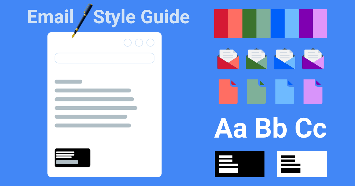
Email Style Guide
![]()
Overview
With diminishing attentions spans, most people spend no more than ~10-20 seconds reading or scanning emails. This highlights the importance of concise and engaging emails to increase open, click-through and (most importantly) conversion rates.
A client asked us to refresh their email templates as part of a strategic market repositioning launch. If you’d like to learn more, follow along as we walk you through selecting the right font, proper formatting and embedding your own logo.
We’ll also save you hours of time by providing a polished email template that you can use in your business correspondence to help your emails stand out in a crowded inbox.
Type Terminology
Font choice can have a big impact on email success rates. Per Unlayer, 70% of readers will delete an email within 3 seconds if not properly displayed or formatted.
Let’s start off by getting a handle on some basic terminology that’s often confused.
Typography
Typography: the design of the writing in a piece of printing or on a computer screen
Typography plays an important role in email design. Selecting good quality, legible fonts is especially crucial for attracting new clients and improving conversion rates.
Typeface
Typeface: letters and numbers in a particular design, used in printing or on a computer screen.
A typeface (or font family) typically refers to a group of related fonts which vary only in weight, orientation, width, etc.
A typeface refers to the overall design of glyphs (letters, numbers and symbols). It includes attributes like serif or sans-serif, script and decorative. Each typeface can have multiple fonts available in different sizes, weights and styles.
Times New Roman is a typeface. It has a particular design for letters, numbers and symbols. Other examples of common typefaces include:
- Arial
- Helvetica
- Georgia
- Verdana
- Courier New
Serif: These typefaces have small decorative legs or strokes at the ends of characters, known as serifs. They are often seen as traditional, elegant, and formal. These include Times New Roman, Baskerville, Garamond and Georgia.
Sans-serif: Sans-serif typefaces do not have serifs, resulting in a clean and modern appearance. They are often considered more informal and suitable for digital media – with Arial, Calibri, Helvetica and Verdana being the most popular choices.

Monospace, Script, Display, Handwritten and Decorative are some other commonly used typefaces.
For business emails, serifs and sans-serifs are the best choices, so we’ll be covering these.
Serifs are considered easier to read than sans-serif typefaces in print, while sans-serif are considered to be more legible on computer screens.
Fonts
Font: A set of letters and symbols in a particular design and, sometimes, size.
More specifically, a font is a specific size, weight, or style (e.g. regular, bold, italic) of a typeface.
Each typeface has multiple fonts available in different sizes, weights and styles. It includes attributes like bold, italic and underline. A font is an actual file that contains the design of letters, numbers and symbols.For example, 8-point Arial Regular is one font, 10-point Arial Italic is another font. Each of these are a specific font, a size and style within the Arial typeface.
A font is a specific member of a type family, such as italic, boldface or Roman. For example:
Helvetica is a font family, while Helvetica italic is a typeface, and Helvetica italic 10-point is a font.
Times is a font family, whereas Times Roman, Times Italic and Times Bold are individual fonts making up the Times family.
Arial is a sans-serif typeface, Times New Roman is a serif typeface.
Within Arial, the following font styles are available:
- Arial Regular
- Arial Italic
- Arial Bold
- Arial Bold Italic
- Arial Narrow
- Arial Black
- Arial Rounded MT
Email-safe Fonts
When it comes to choosing safe fonts for emails, it’s important to consider fonts that are widely supported across different email clients and devices. You can count on it to render well in all of the major email provider systems.
Here are some commonly used email-safe fonts:
- Arial – Sans Serif
- Helvetica – Sans Serif
- Times New Roman – Serif
- Georgia – Serif
- Verdana – Sans Serif
- Tahoma – Sans Serif
- Trebuchet MS – Sans Serif
- Courier New – Monospace (typically considered Sans Serif)
- Lucida Sans – Sans Serif
- Palatino Linotype – Serif
These fonts are typically available on major operating systems and are more likely to render consistently across various email clients and platforms. However, it’s always a wise practice to test your emails across different devices and clients to ensure proper font display.
Recap
Typography deals with the design of the writing in a piece of printing or on a computer screen
A typeface is a grouping of fonts defined by shared design styles.
A font is a particular set of glyphs (character shapes), differentiated from other fonts in the same family by additional properties such as stroke weight, slant, relative width, etc.
Arial, Verdana, and Helvetica are popular sans-serif fonts known for their high readability and clean appearance. Studies have shown that sans-serif fonts tend to be preferred for reading on screens, particularly at smaller sizes. This is because the lack of decorative elements (serifs) makes the characters easier to distinguish.
Email Terminology
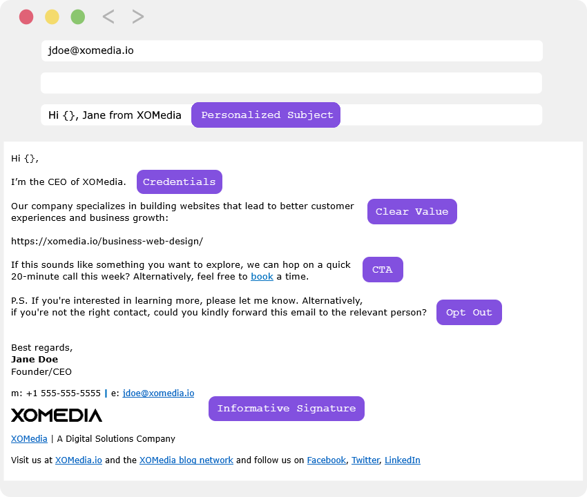
Email communication should be clear and concise. Below we provide an effective cold email template based on research and anectodal evidence.
Subject
Research has shown that personalizing the Subject line increases open rates. Obviously, this is a very important 1st step if your email is going to be read.
Subject: Hi Ben, Jane from XOMedia
Body
Consider including the following if this is a marketing email:
- Personalized Opening:
- Don’t sound like a cold email. Briefly mention something specific about their company or role.
- Avoid formal tone. Write like you talk (conversational tone) – using simple language.
- I had a habit of immediately switching to the Sent folder to read emails I’ve just sent to clients. If it’s an important enough email, read it out loud to a colleague or a family member.
- State Purpose: Get to the point using simple, clear and concise language outlining a single benefit (value prop).
- Clear Value: Pain point > Benefit. Mention how your product/service can address their needs.
- FOMO: Use scarcity, or add a sense of urgency to an offer, “Use the following code to redeeem your $100 offer by December 24 on your next purchase!”
- Exclusivity: Offer a discount to loyal clients.
- CTA: Include a compelling single Call To Action, e.g., download a resource, schedule a demo.
- Avoid too much self-promotion: Focus on the customer – framing the message around their needs.
- Social Proof: Include trust signals and endorsements such as testimonials, product usage or media reviews.
- Cliche Phrases: Avoid weak phrases such as: “Sorry to bother you”, “I hope this email finds you well.”, “I’m reaching out to you today because”, “Any chance you have a few minutes to chat?”.
- Word Count:
- Short emails get more replies. Try to stay within 100 words (but no more than 200) with short paragraphs using simple (6th-grade words) that can be easily scanned.
- Keep lines at 80 characters and use scannable elements like lists and buttons.
- And, don’t overwhelm your prospect with too much INFO. Leave them curious and wanting more- so you can book and close over a call.
Signature
Prospects will only respond to emails that appear legitimate.
Adding a signature to cold emails gives a more professional appearance and will increase response rates. You could include a proper signature with your name, title, links to your website and social media profiles.
It also serves as a valuable avenue for recipients to delve deeper, to quickly see key pieces of information about you and your company; this helps them decide whether to respond or not – and and increases the chances of converting prospects into clients.
- Company Description Line: This is a descriptive phrase that briefly explains what the company does.
- Company Identifier: This simply identifies the company the sender works for.
- Company Branding Line: This line serves a branding purpose, reminding the recipient of the company name and its association with the sender.
In our example, the signature has a Company Identifier and a Company Description line. It clarifies what kind of services the company offers. It also explains Jane Doe’s role in the organization.
So, make your email signature informative by at least adding your full name, title and company name – to build brand and trust.
Core Elements
These styles can be applied to both intenral and marketing communication.
For our template, we're using Verdana and feel that it is one of the most legible fonts and encourages the recipient to read the content.
For rich text, set your email client compose format to HTML.
Body
Typeface: Verdana
Font style: Regular
Font size: 9pt or 10pt
Font color: black
First and Last name [line 1]
Typeface:VerdanaFont style:
BoldFont size:
10ptFont color:
BlackJob Title [line 2]
Typeface:VerdanaFont style:
RegularFont size:
9ptFont color:
BlackUnit, Sub Unit [line 3]
Typeface:VerdanaFont style:
RegularFont size:
9ptFont color:
BlackPhone numbers and Email addresses [line 4]
Typeface:VerdanaFont style:
RegularFont size:
9ptFont color:
BlackCompany Logo [line 5]
Official company logo: The XOMedia logo in the template example below has a width of 206px and height of 30px.
Company Information [line 6]
Typeface:VerdanaFont style:
RegularFont size:
9ptFont color:
Black{With matching color hyperlinks}
Promotional Offer (optional) [line 7]
Typeface:VerdanaFont style:
RegularFont size:
9ptFont color:
Black{With matching color hyperlinks}
Social Profiles (optional) [line 8]
Typeface:VerdanaFont style:
RegularFont size:
9ptFont color:
Black{With matching color hyperlinks}
Summarizing above:
Line #1: First and Last nameLine #2: Job Title
Line #3: Unit and / or sub-unit
Line #4: Phone numbers and Email addresses
Line #5: Company Logo
Line #6: Company Information
Line #7: Promotional Offer (optional)
Line #8: Social Profiles
Consult your email client’s standard documentation to edit the appearance of your email messages and signatures.
Body / Message

First Name Last Name
Job Title
Sub-Unit, Unit
Phone Number (office) | Phone Number (mobile) | Email
{LOGO}
{Company tag line}

{Promotional offer}

{Social Profiles}
Examples
Other Variations
Example #1 (long)
Have a great day!
Jane Doe
Founder/CEO

m: +1 555-555-5555 | [email protected]

XOMedia | A Digital Solutions Company

Visit us at XOMedia.io and the XOMedia blog network and follow us on Facebook, Twitter, LinkedIn
Example #2 (long)
Have a great day!
John Smith
Network Admin
Network Administration Team, IT

Office / Mobile: +1 555-555-5555 | [email protected]

XOMedia | A Digital Solutions Company

Visit us at XOMedia.io and the XOMedia blog network and follow us on Facebook, Twitter, LinkedIn
Example #3 (short)
Thanks, Jane

XOMedia.io | A Digital Solutions Company
Example #4 (text-only cold emails)
For cold emails, keep links to a minimum. Also, as mentioned earlier, you may need to add a physical office address. Adding this to your signature helps you stay compliant with laws and regulations such as the CAN-SPAM Act.
Have a great day!
John Doe
Team Lead
Content Marketing Team, Marketing

123 Main St, New York, NY 10023
Office / Mobile: +1 555-555-5555 | [email protected]

XOMedia | A Digital Solutions Company

Visit us at XOMedia.io
Test
Send test emails to ensure good quality and readability before launching a marketing campaign or sending out to a large number of people.
To ensure compatibility and responsiveness it’s important to:
- Test your emails across different email clients and platforms such as Gmail, Outlook, Yahoo Mail and Apple Mail.
- Test on desktop, tablets and mobile to ensure that the email renders as intended across various devices.
Tools such as Litmus or Email on Acid can help with this process.
Takeaways
In this post, we discussed techniques for crafting emails that read and look personal and professional.
This can be especially important for things like:
- Establishing a consistent brand image: For both external and internal communication (encourage employees to be brand ambassadors).
- Marketing campaigns: Increase open rates for cold and warm emails.
We hope you enjoyed this article, please share your thoughts and feedback in the comments below.
Thanks for reading!
XOMedia is a full-service IT solutions provider. Learn how your business can benefit from XOMedia's 30+ years of experience with our Consulting and Partnership services - all work is backed by our 100% guaranteed.
Back to Blog Home